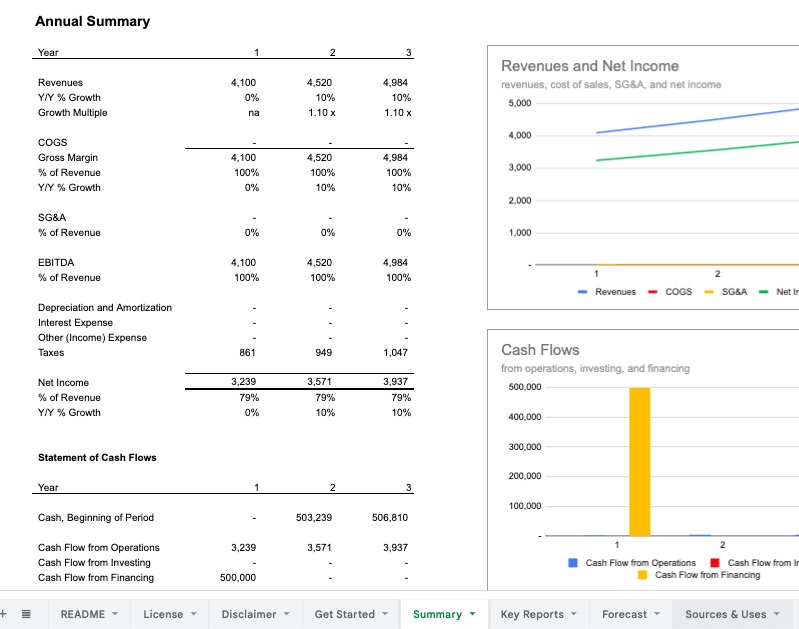
Formatting is an important part of building a structured and transparent model, as a consistent formatting scheme provides an easy way for a person to understand how a model is structured at a glance. Once you've designed your spreadsheet layout, using a color formatting scheme helps you easily understand and communicate how the model works.
A common color scheme I've used by many modelers uses three basic color conventions:
- Blue font color to denote an input
- Black font color to denote a calculation
- Green font color to denote a number that is pulled in (imported) from another sheet in the model
Here's the FAST Standard on colors:
While the Standard does not attach any philosophical importance to the choice of colours per se, one of the intentions of the Standard is to engender a shared language of modelling across practitioners. There is a case therefore for all users of the Standard adhering to the same colour convention for imports and exports, simply to reduce the incremental effort required to decode a model where the Standard convention has not been followed. Normally the argument for not following the Standard convention comes down to personal preference on the part of the modeller, which, as aesthetically sensitive as the individual may be, is outweighed by the industry network-effect of shared communication protocols.
To that end, FAST has two notes on color formats:
- Mark exports with red font and imports with blue font (FAST 1.01-06)
- Mark intra-sheet counter-flows with grey shade (FAST 2.01-05)
In my Foresight models, I use two basic conventions:
- Blue font color with light grey shade background to denote an input
- Black font color to denote a calculation
Why the difference in approaches here? The use of blue font combined with the grey shaded background is primarily personal asthetics, as I think it stands out a bit better than just flat blue font, and I think it feels more like an input field that we would see in a website or a web app. I think it's easier to read and less demanding than a red, yellow, or green shadeed background, all formatting schemes I see from time to time.
I also don't use the green font convention (or mark exports with a red font, as perscribed by FAST), and it's primarily because I use an extensive amount of sheet-to-sheet linking, and the formatting would simply become too distracting.
At the end of the day, I agree with the FAST Standard, that a shared language is valuable and clearly explaining the color formatting used in the model is critical. A model without any font colors or shading or indication of the inputs is much harder to use, as color is an effective signal to show people what different components do and what to pay attention to.
My models note the color convention used in their README sheets, and you are free to alter the color formatting I use to fit your needs. In general, my models are styled to be clean and easy to understand, but do not use much extra colors, different font sizes, or other formatting conventions to highlight parts in the model, so it is easy to add in your own desired formatting to highlight what you want.
